examples of services page designs
How To Build A High Converting Service Page Design (+10 Real World Examples)
- Design
- 10+ High Converting Service Page Design Examples
In order to succeed in the increasingly competitive market, it is essential to invest in good web design.
Let’s face it: creating the perfect landing page for your services is difficult.
The best services web pages strike a balance between being informative and trying to elicit a sale.
Going too far in one direction will make you feel like a low-rate wikipedia page, going too far in the other will put you on par with used car salesmen.
So how do you do it; how do you make a service page that will actually resonate with your customer?
We’ve worked with dozens of companies to improve their service business or B2B web design. While there is no one size fits all answer to constructing an effective services page, there are a number web page design principles we’ve found to be universally successful. Don’t miss out on potential business opportunities – trust a professional web design company to deliver exceptional results every time.
In this article we’ll be exploring those principles along with sharing industry leading services page website design ideas you can learn from.
Ready to dive in?
PS. If you prefer to watch instead of read? Watch the video recap below.
Section 1
10 Examples of Great Services Page Design + How It Can be Improved
Let’s be honest, most services pages are snoozefest. They’re either too vague, too wordy, or just plain forgettable.
But when done right?
A great services page can spark interest, build trust, and move prospects one giant step closer to “let’s talk.”
We’ve rounded up 10 standout examples (and we’re not just handing out gold stars).
We’ll break down what each gets right and where there’s room to level up, so you can build a page that actually drives conversions (not just clicks).
1. Punchlist
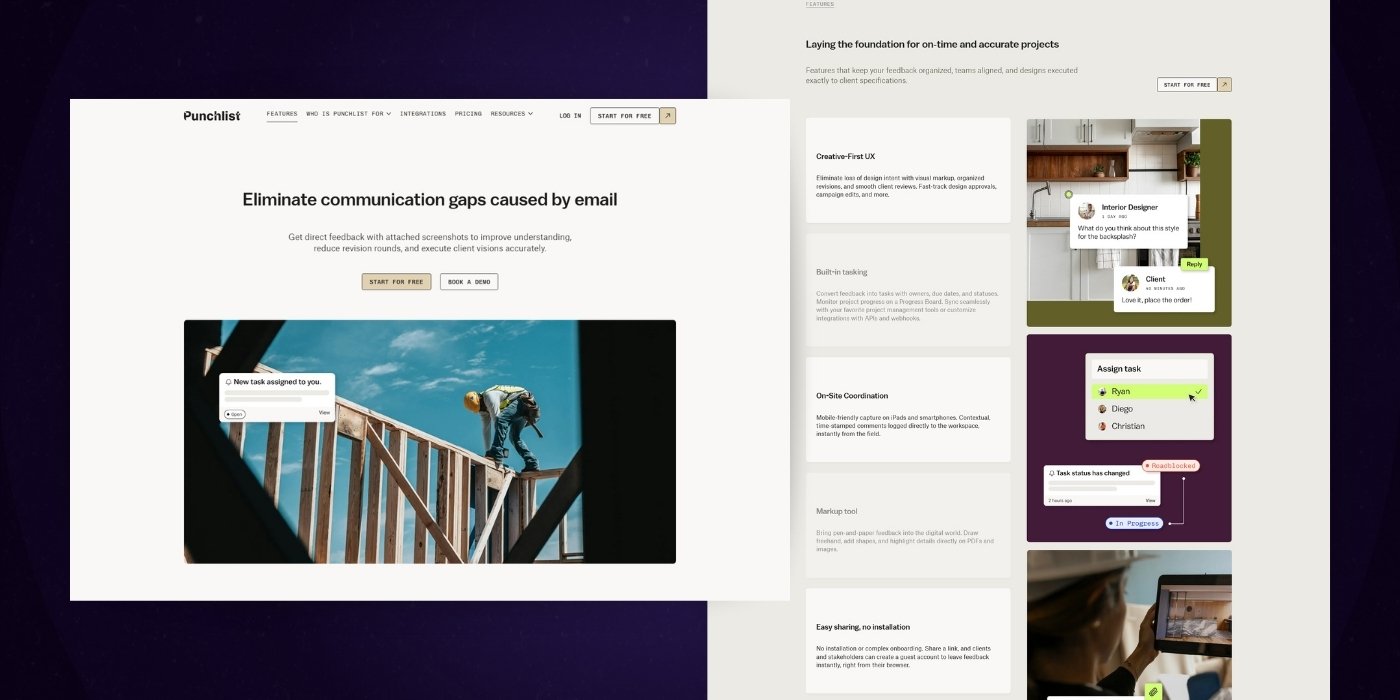
Kicking off our list of company website design examples is the "Construction Managers" page from Punchlist.
Here’s what we like:
- It provides us with a clear, concise, and bold opening statement. “Go from design to build without losing crucial details”
- The follow-up to this statement offers three clear value propositions that speak to client pain points.
- The personalized testimonial in the next section greatly humanizes the service and connects with the value props mentioned above.
- The integration section makes it clear how it can connect to other critical tools their customers use.
- We love the use of a FAQs section to drill into the questions customers actually need answered.
- They end the page with a soft call-to-action that asks for the user’s info.
What we'd improve:
- The fixed scroll experience for the value props isn't super intuitive, and may inhibit users from progressing down the entire page
- Calls to action don't have the best contrast with the page, and in our opinion, could easily be overlooked.
2. Lianz Surfaces
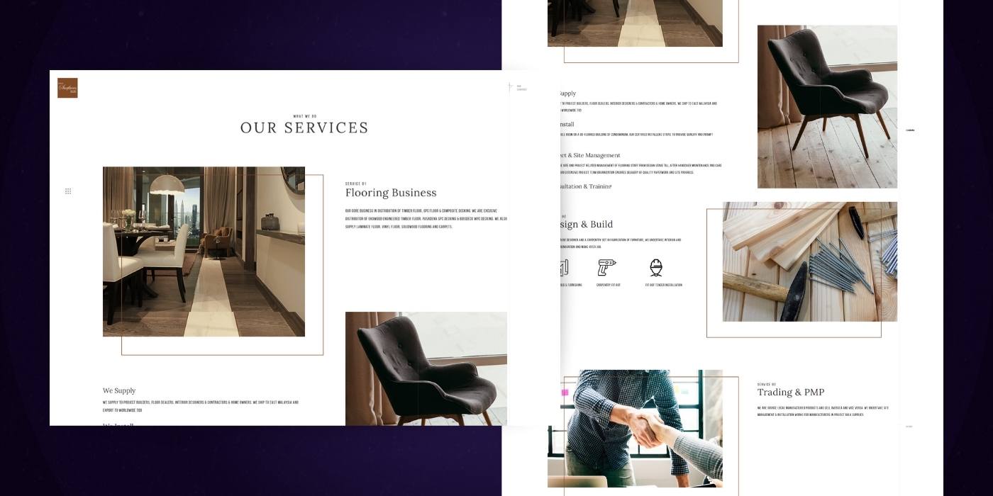
Lianz Surfaces offers a really unique example of a WordPress website services page.
Here’s what we like:
- Once you land on the page, you immediately get presented with a couple of high-quality images of their work.
- The page quickly highlights their three main service areas: Flooring, Design & Construction, Trading & PMP.
- We enjoy the subtle touch of the breadcrumbs on the right-hand side to help encourage users to scroll.
What we think could be improved:
- The font chosen for paragraphs is pretty tough to read. You really should only be using the forced uppercase condensed font for titles.
- While we love the page layout concept, something feels off about the three services. I think there is a way to present them more consistently.
3. Vitesse Transport
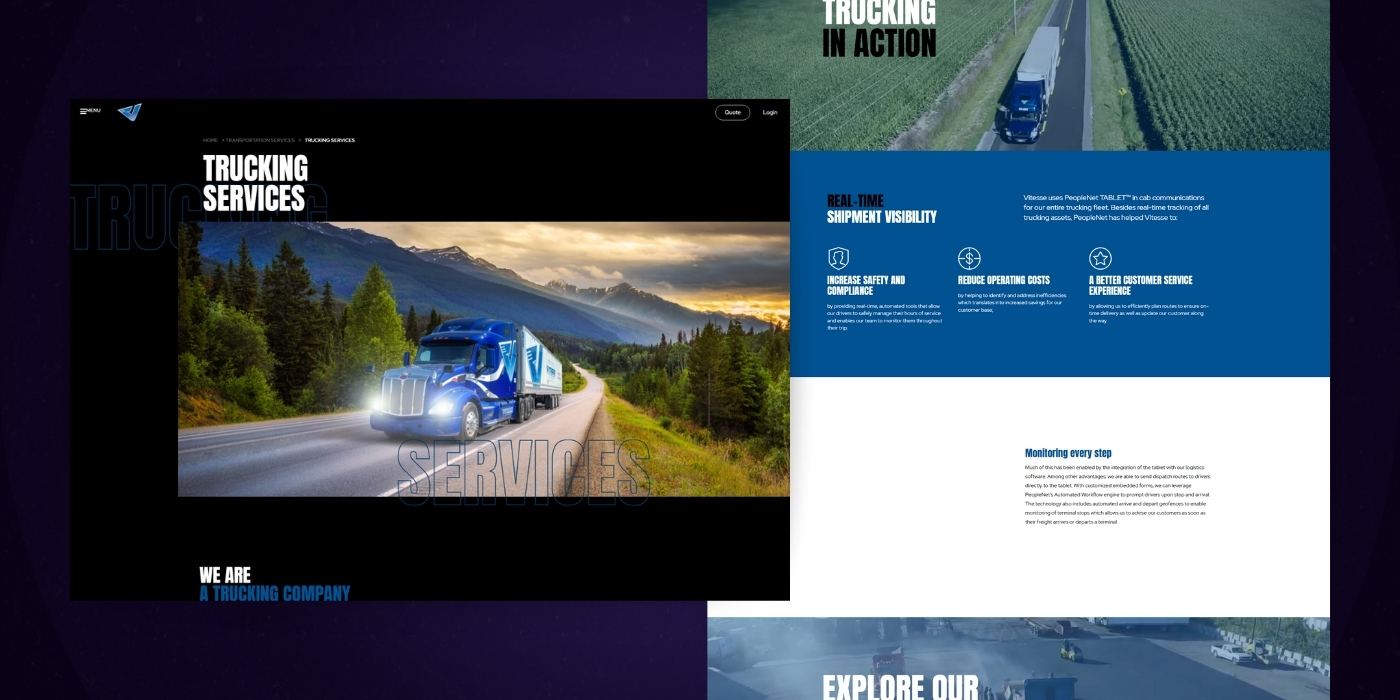
Vitesse Transport has a pretty trucking good services landing page. (sorry for the pun, we couldn't help ourselves)
Here’s what we love:
- The opening frame makes what they do and what they can provide really clear.
- The 4 line icons to represent each truck are well-stylized and on point.
- We like that they’re not only highlighting their technology but also discussing how that technology improves service for their customers.
- The second video on the page highlighting their new yard seems well placed, and we think it further emphasizes the professionalism of Vitesses’ company website.
- We like that they have a touchpoint that speaks to their average customer size.
- The page ends with a clear call to action to get a quote and close the sales loop.
What we think could be improved:
- We don’t think the first corporate video is necessary. It doesn’t really add value to the website beyond the other content already there.
- The yard video is a cool touch, but it may be overemphasized on the page. It could also likely be shortened to 60 seconds instead of its 2+ minute runtime.
- We like what the personalized trucking services section has to say, but we think it could say that earlier in the page journey, so it is more visible.
4. Hillsboro Aviation
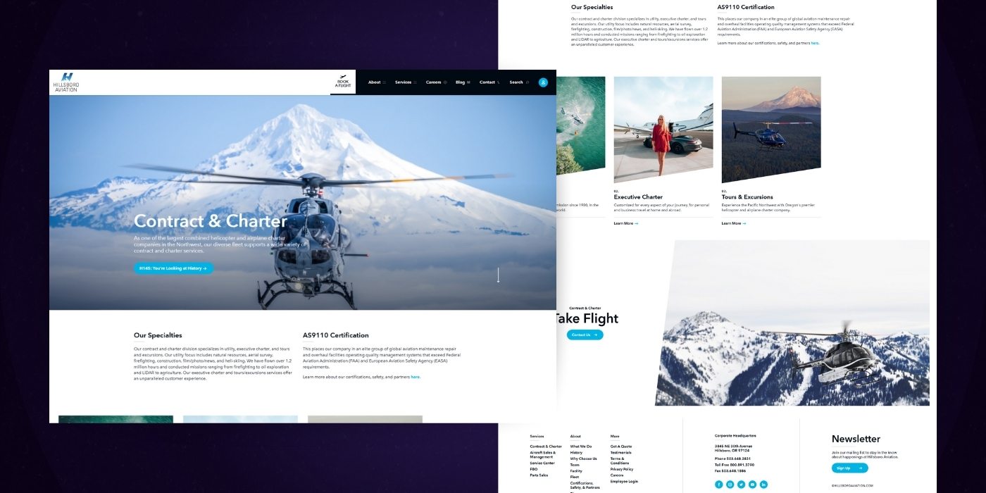
Hillsboro Aviation’s business website design is simple, yet very effective.
Here’s what we like:
- Great use of imagery on the page. Definitely makes you want to sit in that passenger seat.
- The video you can click into is incredible. Really brings some life to the page and shows off some of the tours.
- They quickly call out their locations and introduce you to a custom tour concept.
- They end the page with a call to action to book and close the sales loop.
What we think could be improved:
- We understand that you have the ‘watch video’ button in the hero header, but we think having a 15-30 second loop of the video autoplaying in the background of the hero frame could really enhance the initial experience of the website's look.
5. Huemor
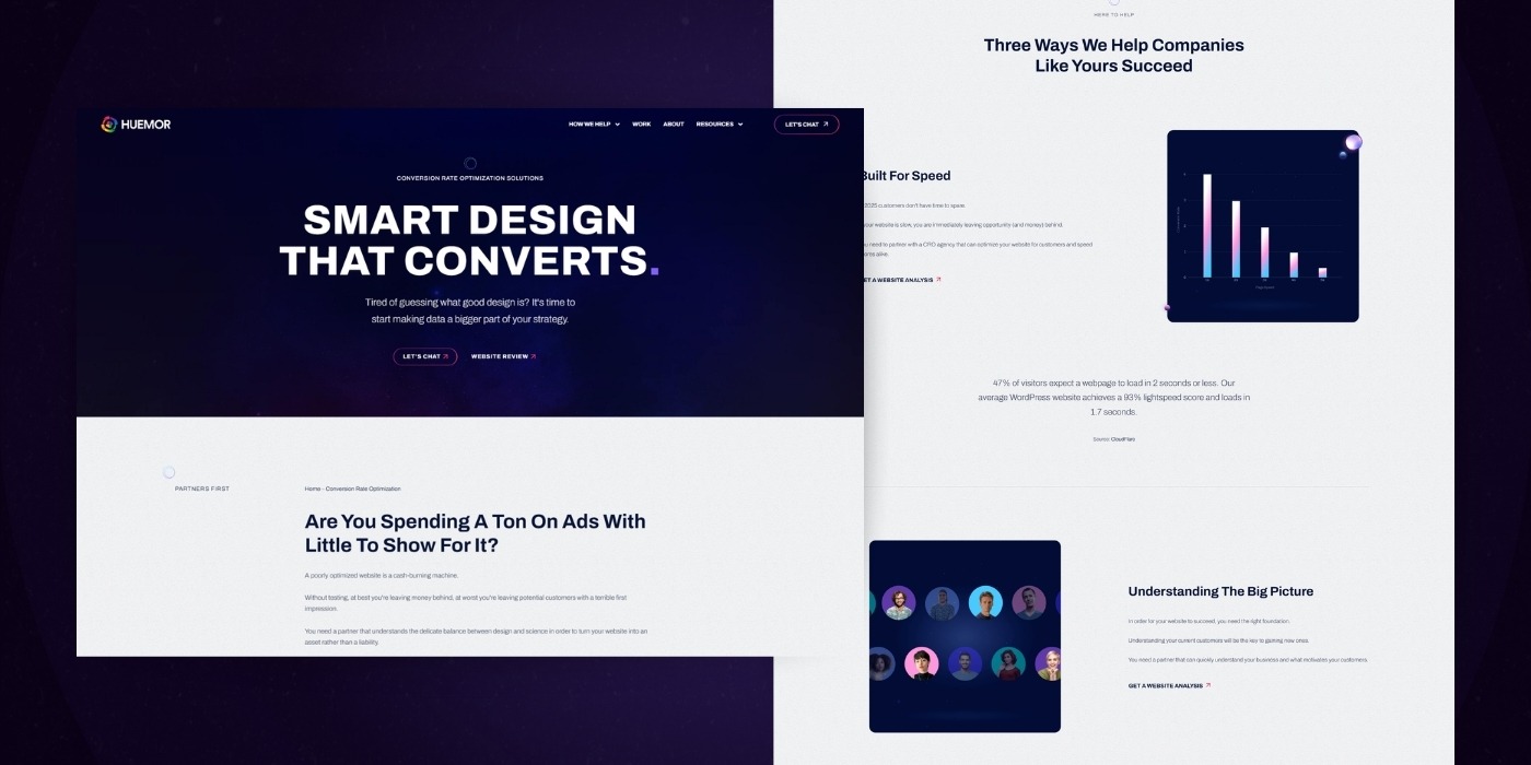
Yes, I know, we’re featuring ourselves. Lame, but we really do want to point out some of the things we think you could learn from our service website design inspiration:
- Our opening statement and supporting paragraph are really clear about what our business focuses on.
- We’re accomplishing a few different things in each of our service sections:
- 1. A quick statement about what we do.
- 2. A quick bulleted list of the capabilities for the leading service.
- 3. Clearly defined business deliverables.
- 4. There’s a clear next step from the service section to “Learn More”.
- We’re using a background line element to draw visitors down the page and encourage scrolling.
- We’ve done our best to pair real client testimonials with each service.
- Further down the page, we introduce you to our core philosophy surrounding our services.
- We end the page with clear next steps: contact us or view some of our work to get new web design inspirations.
6. Ester
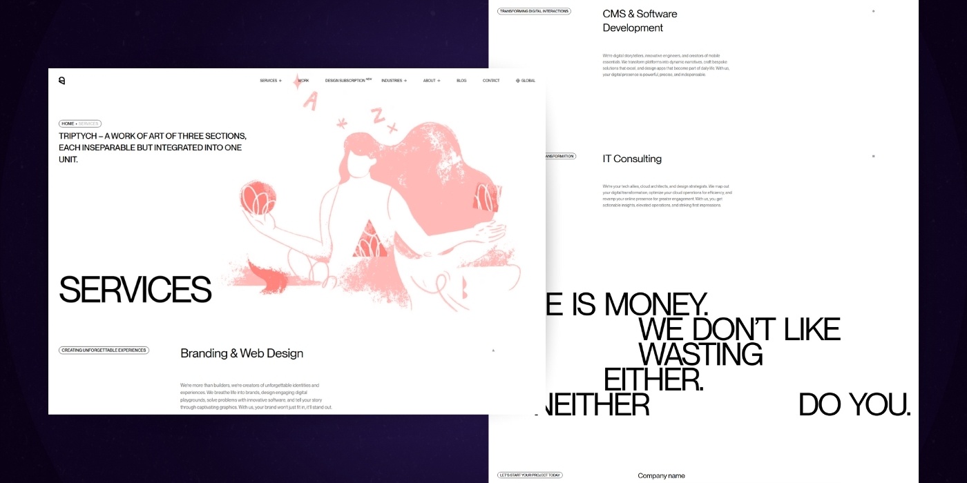
Ester’s graphic design services page is an excellent example of how to bring many great design ideas together in an organized and visually appealing way.
Here’s what we like:
- Each section is really clearly defined.
- We really enjoy the incorporation of work examples within each service section, which reinforces the quality of the work.
- The page has enough interaction to keep it interesting, but not so much that it becomes distracting.
What we’d like to see improved:
- The opening statement to the page itself is confusing. That could be re-worked a bit.
- As digital marketing evolves, so must the content that businesses use to reach their target audiences. The content on each section could definitely be re-worked a bit as well. It doesn’t feel super benefit-driven.
- The hyperlinks on the right feel redundant when they overlap with the images below. This could be a great opportunity for a website redesign project.
7. 4por4
4port4, a web design company, delivers an enjoyable services page experience.
Here’s what we like:
- The overall experience of the page is pretty fun. If you’re looking for an experience that includes motion design, you know you’ll get it without reading a word on the page.
- The callout to client experiences up front is nice for setting expectations.
- Each section is clearly defined with clear bullet points for capabilities.
- We like the inclusion of graphics and gifs in each section. Helps bring some visuals to the service line.
What we’d improve:
- They’re not getting a ton of value out of their hero header. The opening statement could be more descriptive. The hero image is actually working against them by pushing the key info out of the frame.
- We’d suggest taking the motion design back one notch. Love the motion on the graphics, but maybe lose it on the section headers?
8. Wired Avenue
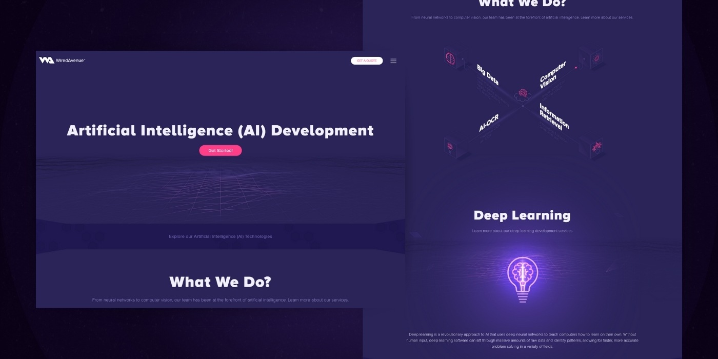
Wired Avenue’s service overview and service inner pages are textbook examples to follow for your SaaS website design.
What we like:
- The service overview page is clean and concise.
- Icons work well with the titles on the page.
- The hover effect for each individual service page layout feels polished and professional, but not overdone.
- We like the use of animated SVGs with the introductory title and paragraph on each individual page. It definitely grabs your attention.
- The graphics that support the points lower on the page do a good job connecting.
What we’d improve:
- Overall, the content on the individual pages are speaking more to the technical ‘how to’ of the services and less so the business deliverables the services provide. Feels like a miss.
- Each individual service page could benefit from a call to action that drives someone to contact Wired Avenue.
9. Upflow
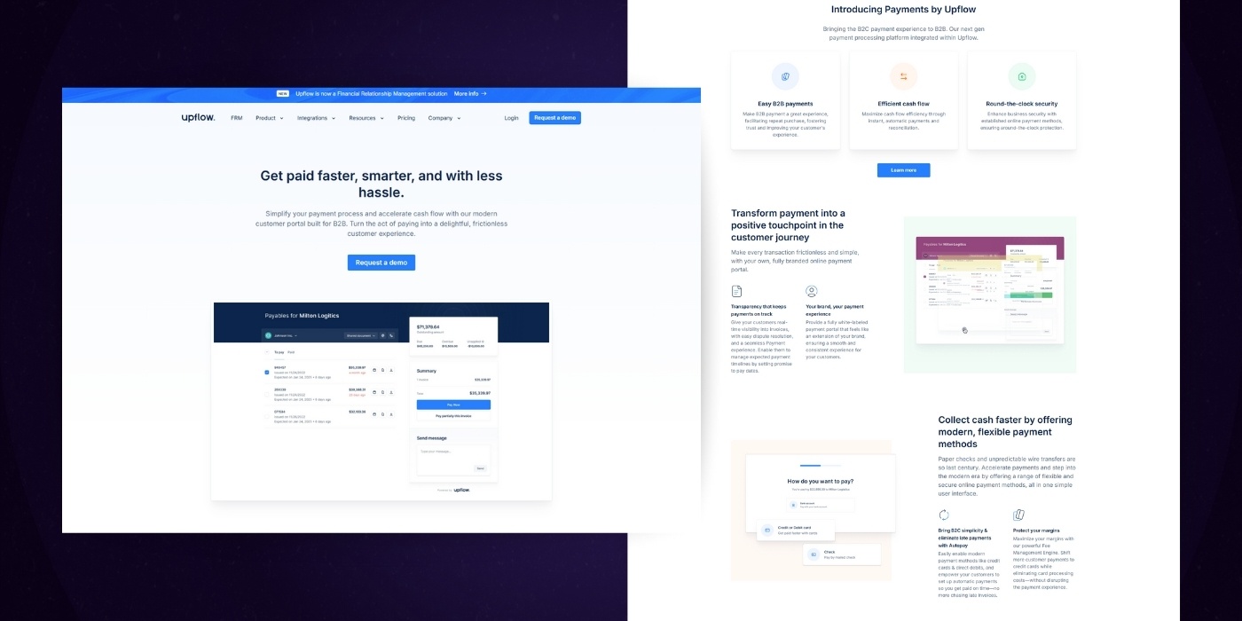
If you’ve read our top homepage design examples post, you may already be familiar with Upflow.
Here’s what we have to say about their website design:
- The opening statement is clear and benefit-driven. The visual they chose to use also summarizes the statement really well.
- Their strategy for each section, as you scroll down the page, is top-notch. They lead with a benefit and then identify what key features help make it happen. They also pair a snippet of their product image to help also visually communicate the point.
- They provide two click-through paths for more information on specific features for those who may need a bit more information. By offering visitors these options, their product landing pages can increase conversion rates and boost sales.
- Right before the final CTA on the page, they highlight some client testimonials. Not only do these say great things, but they also look great.
- At the end of the page, there are two options: Book a Demo or Create a Free account.
What we’d change:
- Our only critique would be to drop the ‘Create A Free Account’ button from the final CTA. You have a persistent version of it in the site header, and you also presented it in the initial frame of the page. That leaves room for you to have a strong, singular call to action.
- We’d also suggest testing an in-page form for the ‘Book a Demo’ option instead of the CTA. It doesn’t always work flawlessly, but it can usually lift conversions on the page.
10. Aanika
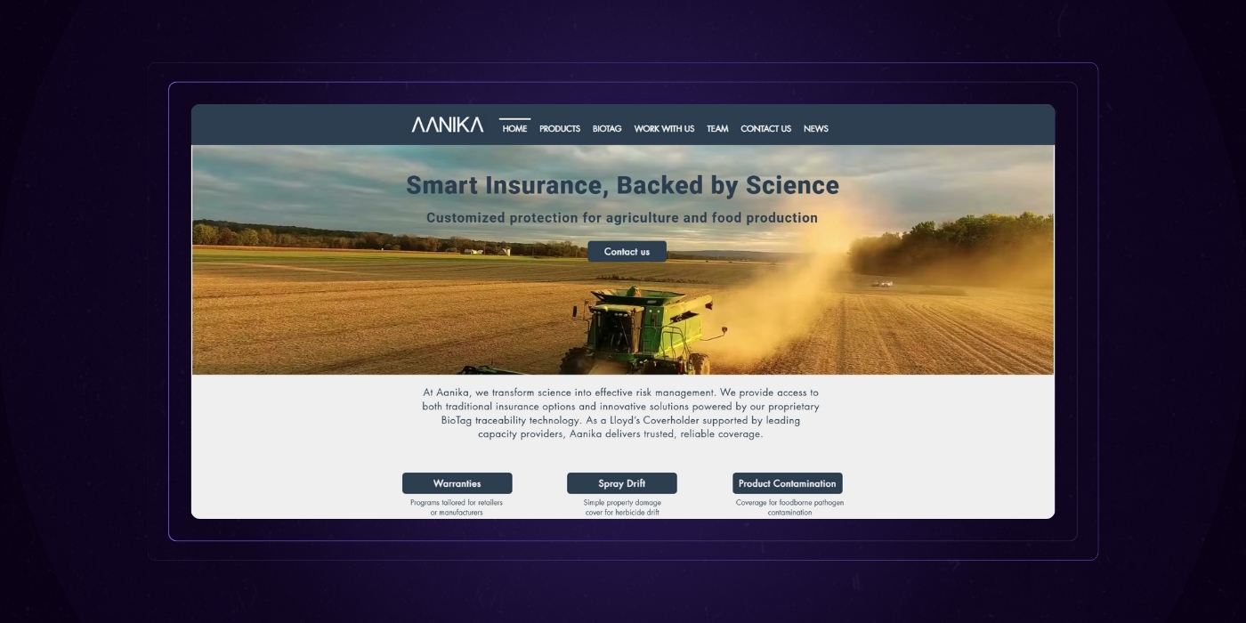
Aanika’s futuristic service page layout definitely does a great job of combining aesthetics and marketing copy.
Here’s what we like:
- The supporting text underneath the header on the page provides good information about what Aanika actually is.
- The graphic supporting the opening statement is definitely attention-grabbing.
- They call out specific features early and then speak to their business benefits directly underneath the titles.
- Love the idea and content behind the larger benefits section.
- They end the page at a clear call to action to get in contact.
What we’d suggest to improve:
- Adding some subtle motion to the hand would be nice. Something simple like the dots bubbling up or slight movement on the fingers could bring the web design over the top.
- The benefits section's contents are fantastic, but we feel like the presentation could be tightened up. Instead of having each user type (businesses, consumers, the planet) in its own frame, present them together in three columns. Also, the points made for each would be more easily read as bullet points.
Want A Custom Review For Your company's Services Page? Fill out our free website review request form. If you qualify, we'll provide you with a detailed breakdown of your services page and broader website.
Section 2
How to Structure Your Service Page Content
Like almost everything else in life, having a strong foundation (website structure) is going to be key for the success of your services section.
Getting this right will not only improve user experience, but it will also set you up for improved search engine optimization.
Individual Services Pages vs A Single Service Overview Page
A common question we receive from businesses we partner with is something to the effect of: “Should I just list all of my services on a single page, or should I create individual pages for each service?”.
The quick and short answer we give is: You should have both.
Single service pages and individual ones inherently serve different purposes in your website design.
Let’s take a few moments to explain.
Individual Service Pages
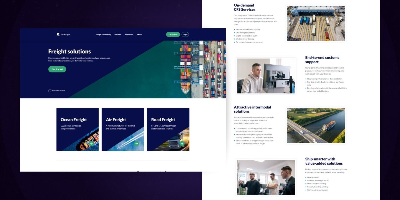
Individual Service pages are also often referred to as landing pages. These are pages on your website design that are focused on a single, specific service offering. Some of the quick advantages to these pages are:
- They allow you to be hyper focused on a specific topic (service)
- They can be heavily optimized for organic search based on specific key terms
- They can act as effective first touch points or entrance points for new users
- You can really elaborate on your benefits and differentiators here
Ultimately, individual service pages are a powerful tool for delivering information to new users.
We find that these types of website templates get viewed most by new users when they’re the entry point of the site. A brand new user entering in from your homepage will be less likely to visit these pages on their first website visit.
Service Overview Pages
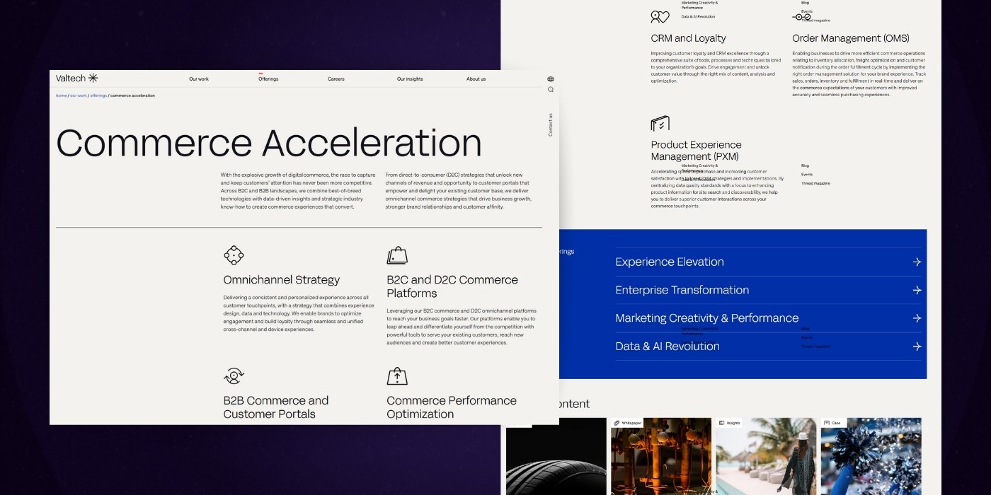
Service Overview pages are a single destination that lists out all of the services you offer.
These pages are great for first time visitors coming in from somewhere like your home page because they allow the user to quickly understand the breadth of your offerings.
We find that these types of pages almost always get a hit from a first time visitor. Service Overview pages can also be effective knowledge bases for current customers who need to find quick answers to their questions.
URL Structure Best Practices
For a long time there’s been some debate surrounding how URLs should be created.
Some SEOs suggest that the URL contain all of your key terms, while user experience experts suggest keeping it as short as possible.
These two ideologies are often in direct contention with one another.
Let’s say you were trying to rank for the term “Web Design Services New York“.
An SEO might suggest that the URL looks something like this:
/web-design-services-new-york
Where a UX expert might suggest the URL looks something like this:
/web-design
Which URL is right?
Neither is perfect, but the user experience expert’s suggestion is actually more in-line with modern standards.
Search engines have been advancing steadily since their creation. While we don’t know the keys to their algorithm exactly, we do know that search engines have been moving away from direct match terms as their biggest ranking factors.
Why? Simply put, it was easy to manipulate.
Search engines instead put focus on topical relevance. This relevance can be built in a number of different ways which we talk about lower in the article, but essentially it comes down to analyzing the whole of the content and grading it on its relevance. Having the extra words in the URL slug itself will yield little to no actual SEO benefit.
So what should you focus on instead? In general, you should be focusing on your content as topics. Each topic will then have sub-topics associated with it.
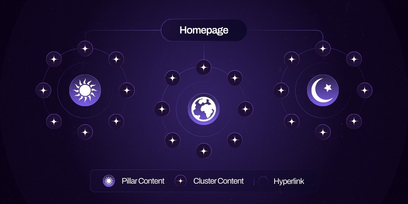
Protip: This article from Hubspot actually does a great job of explaining the nuances of pillar pages in more detail if you’re interested.
Your Ideal Service Page URL Structure
So circling back to the example we listed above, the main topic is ‘services’, and the sub-topic is ‘web-design’, as it’s an individual service. ‘New York’ isn’t really a topic at all, it’s a modifier to the term.
That should leave you with a URL like:
/services/web-design
This URL accomplishes a few interesting things:
- It’s concise, so it fits the short standards of user experience expert
- It contains the term ‘Services’ so it fits the standards of the SEO expert
- Because ‘Services’ is included as a parent page, the authority this individual page (subtopic) generates will help pass authority onto its parent page (topic)
Have you ever thought about URLs this much before?
Probably not, it’s definitely something we see overlooked a lot.
However, getting these fundamentals right can become the difference between how satisfied users are navigating your website design and where you show up in rankings vs your competitors. Don’t skip it.
Website Improvement Plan
Want a free, customized roadmap of website improvements?
Want to know exactly what should be improved on your website before you embark in your next redesign? Request a session with one of our experts below (totally free, no strings attached)
Chapter 3
Creating the Perfect Opening Statement for Your Services Page
You don’t have much time to get your audience’s attention. Just a few seconds, in fact. It’s easy to get caught up with your website design, but what about the copy on your corporate website?
The right opening statement makes those seconds count.
This is where you tell your audience, in as few words as possible, why your service should matter to them. Think of it as an elevator pitch, but with 30 words instead of 30 seconds.
What you should avoid:
- Treating your service like you would treat a product.
- Focusing on ‘we’ instead of ‘you (the customer).
- Focus on features of the service itself, like duration or exact actions.
Instead, focus on the benefits of that service. Put yourself into your audience’s shoes, and try to understand the reasons why they’d want to become customers.
No one gets a haircut because they like the feel of scissors on their scalp. They endure it because of what they get as a result.
In other words…
Services Solve Problems
Craft your opening statement based on two basic principles: poking the pain, and building the benefit.
Poking The Pain
When customers seek out a solution, they hire you because they want to fill a specific need. That need is driven by a deeper pain point. Your copywriting should speak directly to that point. Let's check out the example below from Basecamp:
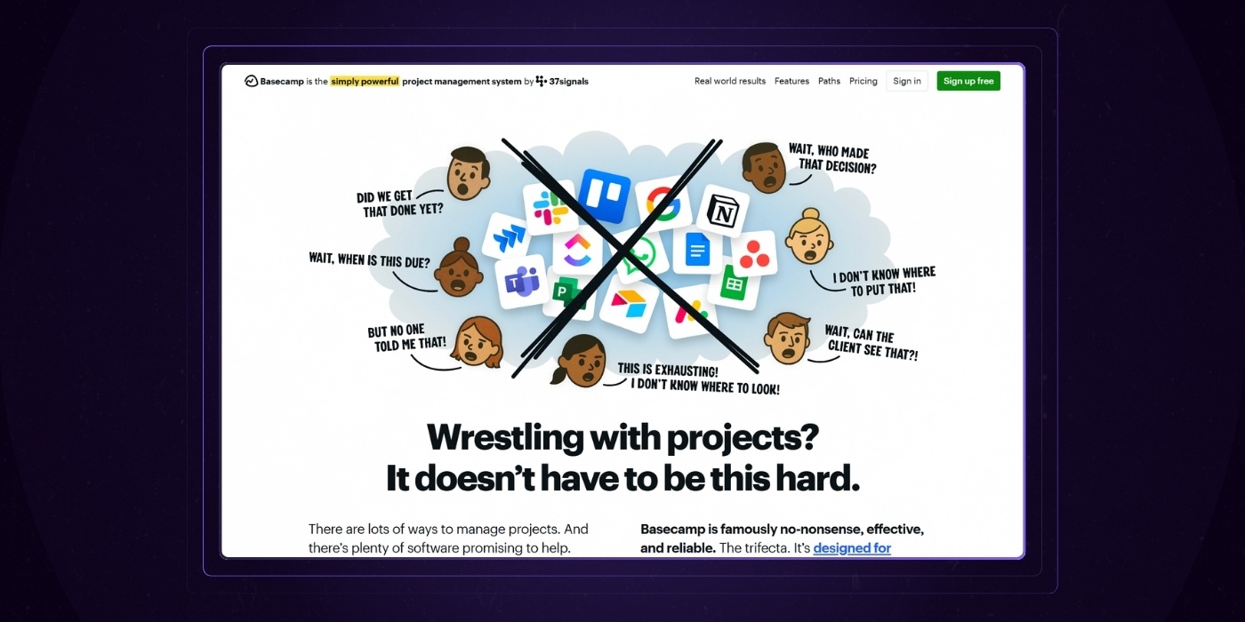
The pain is clear: "Wrestling with projects? It doesn’t have to be this hard."
If you're a project manager, this hits home. You know how hard it is to manage projects already, and if the "productivity tools" you're using aren't making you more productive, they're just getting in the way.
This emotional trigger resonates and let's the prospective customer know "Basecamp gets me".
Building The Benefit
This is your pivot—your opportunity to clearly communicate how your service solves the pain point and what your customers get from hiring you. If you craft it right, the desire to work with you should come naturally.
Let's take a look at this example from Notion.
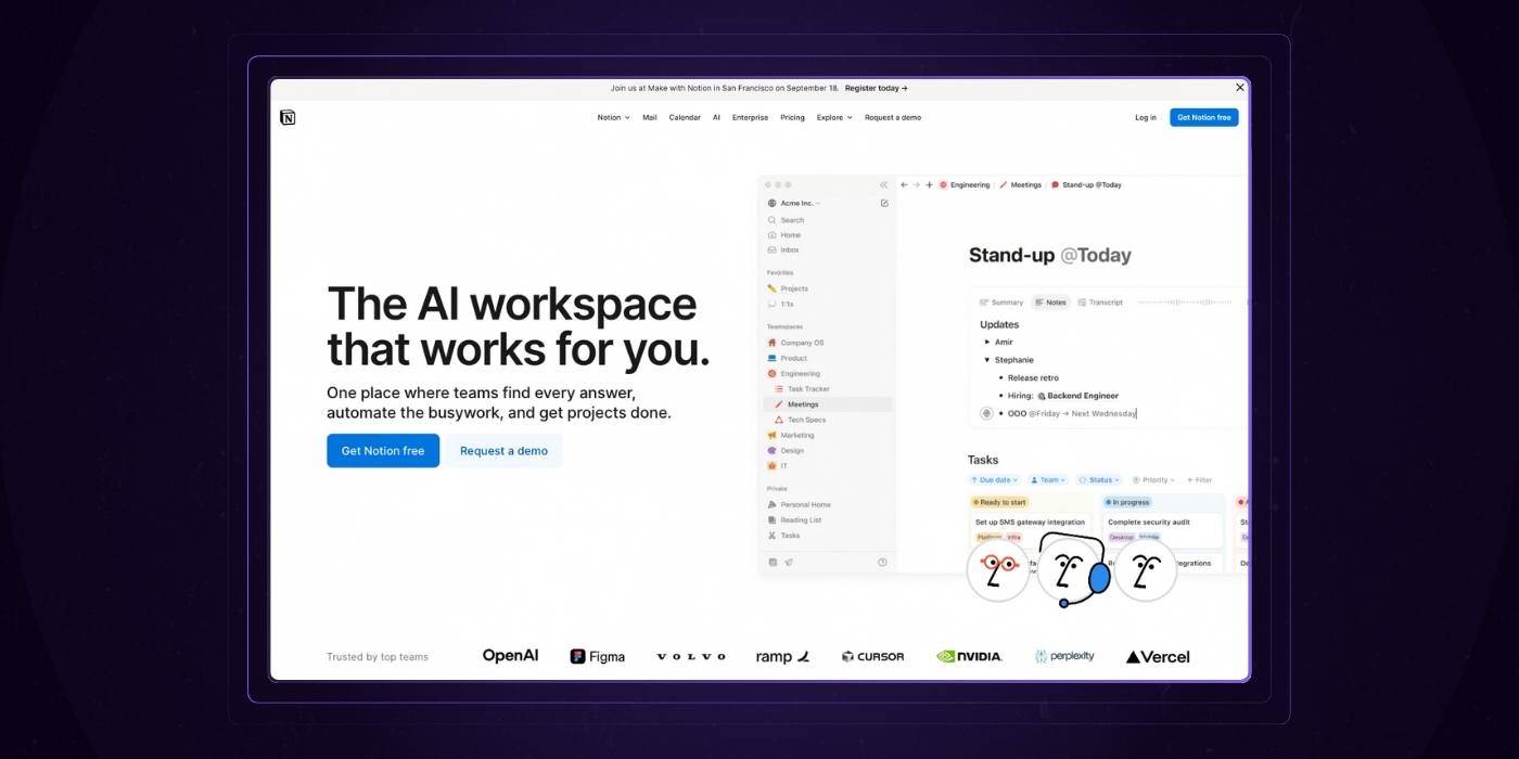
In this example, by using the headline "The AI Workspace that works for you." they're selling an outcome most of their customers want – less work.
Protip: Unsure if you got it right? Test it. Find a member of your target audience and run your draft by them. Are they having an emotional response? Are they convinced in 30 seconds or less? If not, dig into why and revise.
Section 4
How To Establish Trust With Your Service Page
Why would a potential customer let you into their home or wallet? Your service page content helps you answer that question.
It’s about trust. It’s about credibility. And most importantly, it’s about presenting yourself in an authentic way that still showcases your expertise.
Three basic tactics help you accomplish all of those website design goals. Let’s dig into each of them.
1. The Simple Power of Client Logos
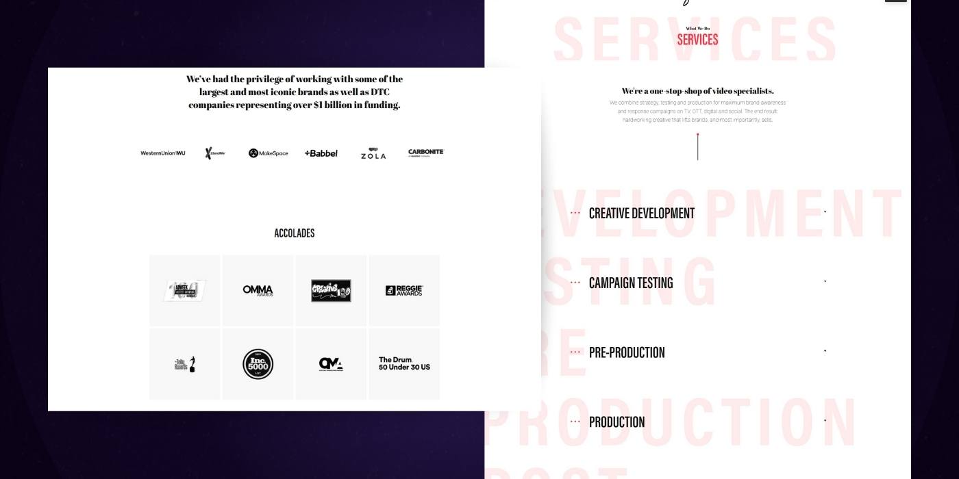
We’ll start with the possibility of including the logo design of other clients you’ve worked with as part of your services page design.
Client logos are an easy and powerful way to build proof of your expertise. They showcase your ability to work with other companies and help them solve their problems.
It’s the power of peer pressure. Your audience trusts you a lot more if they know others like them have already used them. This innovative way to design a web page also makes you more memorable.
Most importantly, logos don’t take up a lot of space on your services page. You can simply dedicate a small portion of the website design to them, subtly reinforcing your expertise in the eyes of everyone who knows the source of the logos.
2. The Nuanced Reinforcement of Testimonials
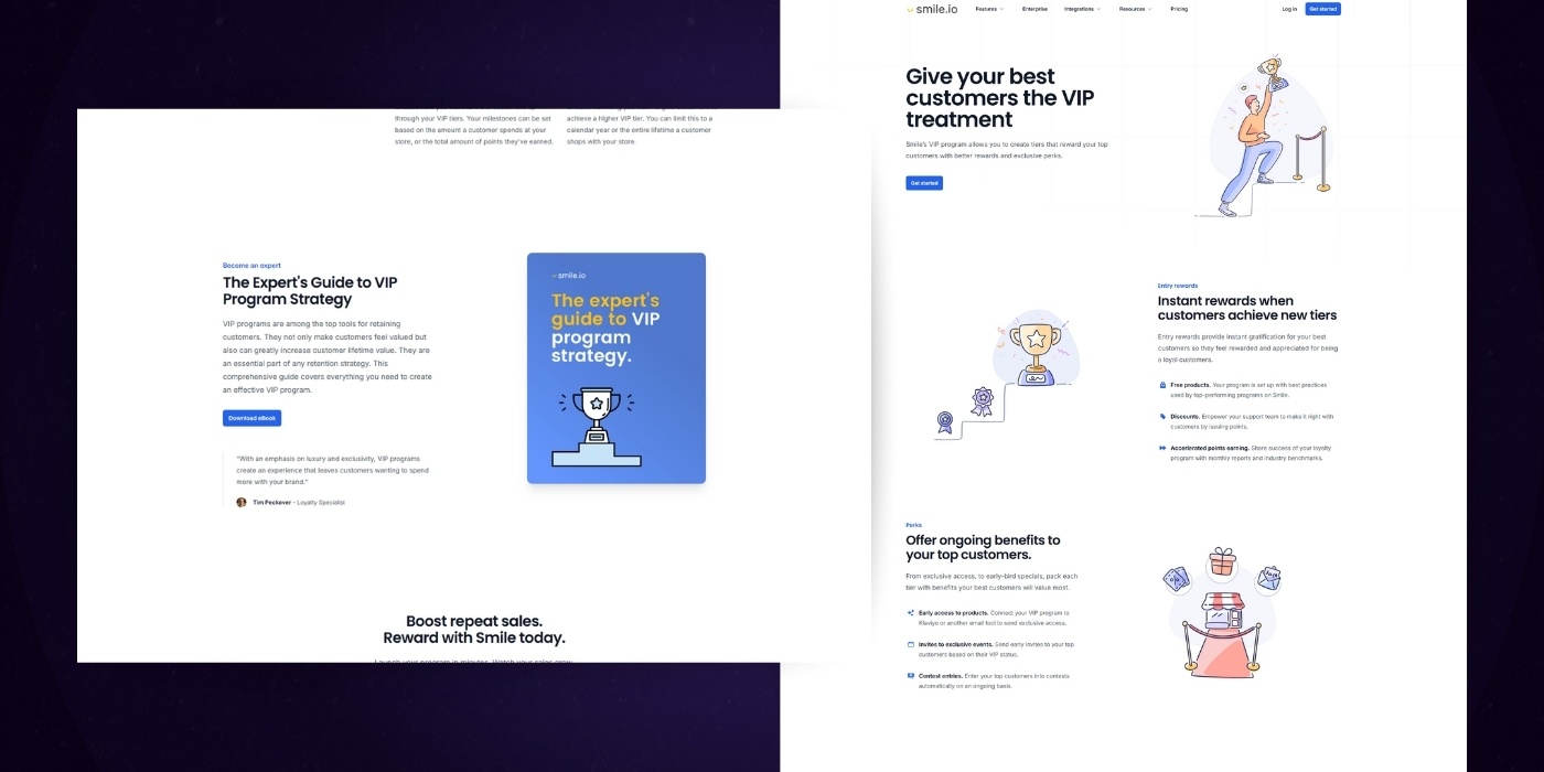
You probably know about testimonials as a core way to build social proof. They take the burden of talking about your benefits from you and put it into the hands of a more easily trusted, independent source.
But are you using them the right way?
No page will benefit from a simple customer talking about your service just being the best. Instead, your audience is looking for nuance.
Ask your existing clients for specific ways in which your service has solved their pain points. The more specific, the better.
You don’t need a book on your page. But you should look for at least a couple of powerful sentences or a short video.
The best testimonials don’t just reiterate your elevator pitch.
Instead, they build on it, taking the high notes and digging in deep. Those specific examples ultimately reinforce your message and build trust throughout your website design.
Again, the objective here isn't to just have a website that looks nice, we want a true marketing and business asset.
3. The Closing Pitch of Customer Results
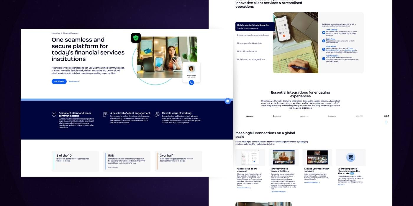
Selling your clients is all about the ROI. Your service should lead to a tangible, positive outcome for anyone who chooses it. Get that message across, and you’re halfway to the conversion.
Showcasing customer results makes that outcome real. They help you put real-world numbers into your page design to move away from hypotheticals.
You can write in-depth case studies that really bring the point home. But those case studies shouldn’t live on the services page.
Instead, use an especially powerful nugget of information to stand out, then link to the case study for those interested. You get the benefit of the big number first, with additional content to dig in deeper.
If you collect enough, customer results can be sprinkled throughout your services page to reinforce your benefits.
Website Improvement Plan
Want a free, customized roadmap of website improvements?
Want to know exactly what should be improved on your website before you embark in your next redesign? Request a session with one of our experts below (totally free, no strings attached)
Section 5
Creating the Perfect Call To Action & Lead Funnel
Your opening statement and social proof combine to drive interest and desire. But that desire doesn’t automatically result in hard dollars. Not yet.
What you need is that natural next step. The conversion opportunity that drives your visitors further down the funnel and into your waiting arms.
That’s what this chapter will focus on. Through two basic concepts, you can begin to build your lead funnel.
1. Build Gated Resources to Gather Contact Information
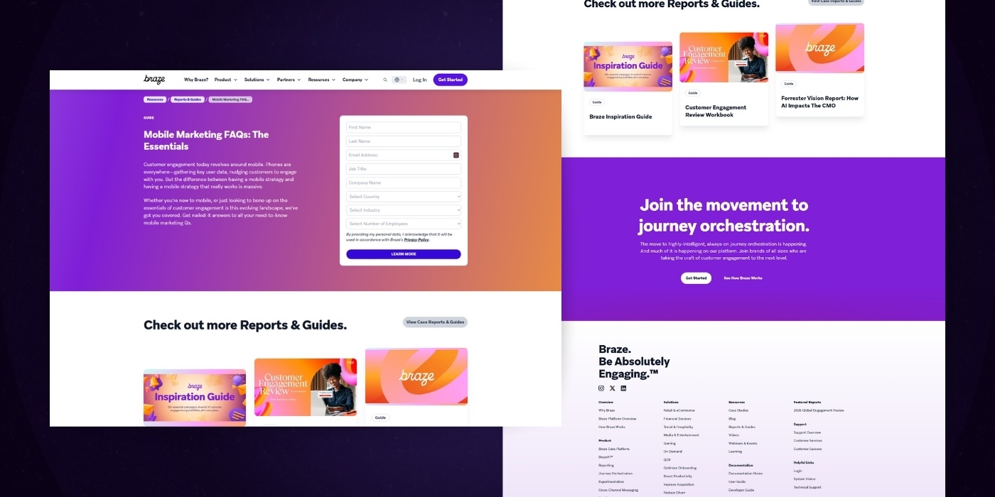
To start, consider offering a helpful resource for your audience straight from your services page. In exchange, ask them for nothing but their contact information.
If that resource helps to solve their pain point, they’ll be happy to give you their email address.
It’s the reciprocity principle. If you give your audience something valuable, they’ll feel compelled to give you something valuable in return.
- Depending on the service you offer, that resource may be any number of things:
- An industry trends report related to the type of service you offer.
- A how-to guide specifically related to the pain point your service solves.
- A webinar that includes an expert interview within your target industry.
And much more.
The resource itself shouldn’t be promotional. Value needs to come first, and the promotion should come after you get the contact information.
When you have that info, your visitor is no longer anonymous. Instead, you can use their email address to build a lead-nurturing sequence specifically designed to sign them up for your service.
That sequence can take on a number of forms. Here’s one example:
- A ‘thank you’ email immediately after the sign-up that provides confirmation of the gated resource
- An email a week later that reiterates your services page content
- An email a week after that with more specific pricing information
- An email a week after that with an invitation to set up a sales call
2. Include Cost Calculators for Upsell Opportunities
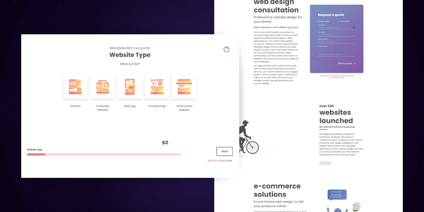
Do you offer a complex pricing model that can’t be explained in a single sentence? If so, a cost calculator can help your audience understand costs—with a few hidden benefits for you.
You can actually include one of two calculator types on your services page:
An understanding of what your service may cost, based on a few basic variables.
An understanding of the value your service may bring based on some numbers from your customer and a few backend ROI numbers.
If it hits the right mix of simplicity and added value, your visitors will flock to the calculator. Hide the result behind an email form and you once again have a lead generation tool.
But that’s not all. Through your calculator, you can also upsell your audience after you show them the results.
Think of it this way: you show the results of the variables your visitors have inputted. But you also show how positively they change with a simple tweak in the variables. That broadens their horizon and gets them to think big.
4. Drive Your Lead Funnel Through Effective Contact Forms
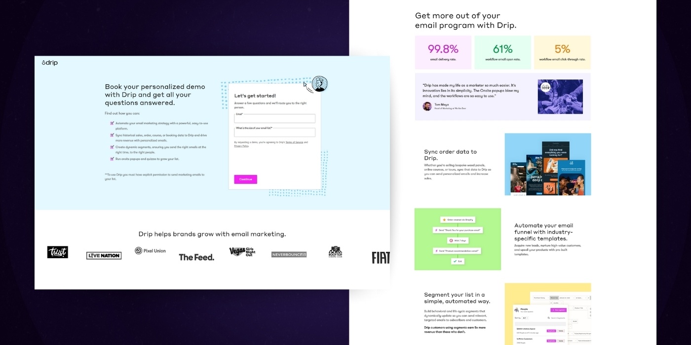
Both of the above tactics require a contact form, the mechanism through which your audience actually signs up. Done right, they provide as little friction as possible in getting that visitor email address.
To accomplish that feat, follow a few basic best practices for contact forms:
- Include only the fields you need. At its most basic, that’s name and email address.
- Every field you add decreases the signup chances.
- Only include info like phone number or client industry if you plan to call or send industry-specific content.
- Stay below seven fields if at all possible. Beyond that, conversion rates start to drop sharply.
- Embed your form in your page when it’s directly related to the content. A simple contact form for more information can be a separate page.
If possible, integrate your CMS and CRM so that new leads automatically enter your customer contact base. That allows you to build automated lead sequences like the above.
Website Improvement Plan
Want a free, customized roadmap of website improvements?
Want to know exactly what should be improved on your website before you embark in your next redesign? Request a session with one of our experts below (totally free, no strings attached)
Chapter 6
How To Optimize Services Pages For SEO
Follow the above tips, and you’ve got a great services page. Now, all you need is to drive traffic to it.
That’s where we turn to an old friend: search engine optimization.
The trouble with service page SEO is that the topics are often so broad, you can’t focus enough for a high ranking on a competitive keyword. That said, you can still make an impact if you get the basics right.
Building a Strategy to Match Your Expectations
Make no mistake: SEO matters. But it’s also unrealistic to think that you’ll suddenly become a top result on Google with a few simple tweaks. That’s important to know as you move into the below.
Build a strategy to match those expectations. Instead of trying to rank highly for broad terms within your industry, pull it back with a few basic guidelines:
- Focus on a single term that’s directly related to your service.
- Aim for a long-tail keyword that reduces competitiveness.
- Look for the low-hanging fruit. What questions would your audience ask that gets them naturally to your service page?
- Perform some basic keyword research. Low competitive scores are a great place to start.
Basic Best SEO Practices for Service Pages
With that strategy in mind, it’s time to optimize the individual elements of your services page. Start simple, by resizing all images and giving them appropriate alt tags to please Google and increase page speed.
Beyond that, you need to make sure your keyword appears naturally but regularly on your page. The title, URL slug, and body copy should all not just mention it, but build value-added content (like an answer to the question) around it.
Don’t forget about your meta description, either. It shows up below your page title in search results, providing a perfect opportunity for some quick but relevant copy.
Finally, make sure to include relevant links. When you mention other but related services, for instance, link to those landing pages to keep guiding your audience in the right direction.
Speaking of internal links: Make sure that throughout your website, your service page gets the attention it deserves.
Search engines like Google consider pages that a lot of other pages are linking to as more authoritative. You can take advantage of that basic fact.
From any page on your website design, include links to your services page anytime they’re relevant. That might be a blog post mentioning the service you provide, or even your homepage.
Don’t overdo it, of course. But as long as you keep it to relevant topics, these cross-links can go a long way towards increasing your search profile.
Cross-Linking to Your Services Page for Increased Authority
Speaking of internal links: Make sure that throughout your website, your service page gets the attention it deserves.
Search engines like Google consider pages that a lot of other pages are linking to as more authoritative. You can take advantage of that basic fact.
From any page on your website design, include links to your services page anytime they’re relevant. That might be a blog post mentioning the service you provide, or even your homepage.
Don’t overdo it, of course. But as long as you keep it to relevant topics, these cross-links can go a long way towards increasing your search profile.
Wrapping Up
Want to do yourself a service? Avoid the pitfalls of bad design and try building a great service page layout. It’s a challenge, but one that pays off big time if you get it right.
This is your selling opportunity. Your chance to show your audience exactly how you can help them. Your opportunity to make the intangible service you offer tangible through its benefits.
That’s not easy. But it’s far from impossible. All you have to do is follow this guide.
When you do, you’ll be surprised at the conversion machine that your services page can become.
Ready to conquer more parts of your website design? Talk to us about our website redesign services.
Website Improvement Plan
Want a free, customized roadmap of website improvements?
Want to know exactly what should be improved on your website before you embark in your next redesign? Request a session with one of our experts below (totally free, no strings attached)
Service Page Design FAQs